Descubrimientos de una inteligencia artificial que supera el test de Turing
On the Internet, everybody knows you're a chatbot.
Buscar en Mind w/o Soul
martes, septiembre 07, 2010
Patrones oscuros: cómo nos engañan las páginas web
El diseño centrado en el usuario intenta crear páginas web y aplicaciones de ordenador fáciles de utilizar, y especialmente adaptadas a las necesidades de sus usuarios
El lado oscuro del diseño aparece cuando las mismas técnicas de facilidad de uso se utilizan para persuadir al usuario de una web comercial, no a encontrar la información que más le conviene como comprador, sino la que más le conviene al vendedor.
Se llama diseño persuasivo a las técnicas profesionales que intentan cambiar el comportamiento de las personas de forma no coercitiva, sólo con influencia basada en principios psicológicos conocidos.
La página DarkPatterns nos muestra una selección de estas técnicas utilizadas cuidadosamente para obtener un diseño que deliberadamente perjudica al usuario. Un usuario cuidadoso será capaz de detectarlas y evitar el efecto pernicioso (a costa de que el proceso resulta innecesariamente más complicado de completar con éxito). Pero como técnica comercial efectiva, es suficiente que unos pocos caigan en la trampa para que sea rentable; un comprador con prisas, con problemas de comprensión lectora o con dificultades de visión es un buen candidato para ser víctima de estos patrones oscuros.
Muchas de estas técnicas no son exclusivas a los ordenadores, pero el medio digital las hace especialmente efectivas. Veamos algunos ejemplos.
Cesta de la compra sigilosa
http://darkpatterns.org/sneak-into-basket/
En el proceso de compra de un producto, aparecen como sugerencia algunos complementos y accesorios. El truco en este caso es que el checkbox para añadir el accesorio aparece marcado por defecto. "Puntos malignos" extra cuanto más escondido y más pequeño.
Es especialmente efectivo si se introduce en la pantalla de revisión final de la compra, donde el botón "Continuar" realiza directamente el cargo en la tarjeta:
Impedir comparar precios
http://darkpatterns.org/price-comparison-prevention/
El precio final calculado no se muestra directamente, sino que requiere activar y desactivar varias opciones, o cambiar alante y atrás entre varias páginas (la navegación llamada de "palo saltarín"). Esta es una forma deliberada de impedir que el usuario compare el precio real de varios de los productos, especialmente frente a sitios de la competencia.
"Desnudo por defecto"
http://darkpatterns.org/privacy-zuckering/
Dedicado a las opciones de privacidad de Facebook, diseñadas para compartir mucha más información de la que el usuario tenía intención.
El nuevo diseño de la interfaz de configuración de privacidad promete que el usuario podrá gestionar fácilmente la información que quiere compartir. Sin embargo, algunas opciones (las más rentables para Facebook como las listas de amigos, aplicaciones, y "me gusta/no me gusta") no se pueden configurar en este sitio, requieren localizar algun botón escondido en rincones poco accesibles.
¿Me dejas tus llaves?
http://adactio.com/journal/1357
Muchos sitios sociales son culpables de este comportamiento. Para facilitarte cargar tu lista de contactos, te piden la contraseña de tu cuenta de correo, en principio sólo para hacer esta lectura inicial de tus conocidos. Esto tiene dos problemas:
- Algunos sitios, en un abuso de confianza, aprovechan para mandar "spam amigo" a todos estos contactos, con contenido promocional del sitio.
- Aún más grave, este diseño habitúa a los usuarios que es habitual proporcionar tus contraseñas a quien la pida para facilitar este tipo de pequeños servicios. En realidad están entrenando al usuario para ser víctima de la estafa del phishing. Por este motivo no se debe nunca, nunca proporcionar en una web tu contraseña de un tercer sitio.
Cargo secreto a la tarjeta de crédito
http://darkpatterns.org/silent-credit-card-roll-over/
Otro clásico. Un servicio te ofrece un periodo de prueba gratuito, y solicita una tarjeta de crédito para comprobar tu identidad. Tras entregarte el producto prometido ("completamente gratuito") te registran al servicio sin mayor aviso. Por supuesto, no hay ninguna notificación adicional al terminar el periodo de prueba; la siguiente notificación que se tiene de la empresa es el cobro del primer plazo del servicio en su phttp://darkpatterns.org/anti-scan-trick-questions/eriodo de pago.
Anti lectura rápida
http://darkpatterns.org/anti-scan-trick-questions/
Para terminar, uno de los más insidiosos. Se introducen elementos en un lenguaje redactado para que a primera vista parezcan inofensivos, pero que en realidad significan lo contrario de lo que aparentan. Especialmente diseñado de acuerdo al principio demostrado de que la gente no lee realmente las páginas web, sólo las ojea.
Especialmente malvados son los checks de suscripción a notificaciones comerciales o cesión de datos escritos de forma deliberadamente ambigua, en los que resulta imposible adivinar cuál de las dos posiciones es la que respeta tu privacidad.
Como vuelta de tuerca adicional, en este ejemplo algunos de los checks tienen significados opuestos en cada línea respecto a la anterior: para evitar suscribirse a ninguna opción, hay que marcarlos en los estados desmarcado-marcado-desmarcado-marcado.
En este último ejemplo, una web de viajes utiliza el truco para lograr el efecto de la cesta de la compra silenciosa. ¿Puedes ver qué se va a añadir a tu factura, salvo si desvías tu atención de rellenar los datos de compra y la dedicas a descifrar las instrucciones ofuscadas?
lunes, agosto 30, 2010
Cómo pagamos la electricidad
La verdad sobre el mercado eléctrico
Comparemos el Mercado Eléctrico con el de la fruta. Un agricultor cultiva patatas en Galicia, y otro mangos en Granada. ...[los distribuidores] se encargan de suministrarlo a las tiendas que lo venden al por menor para que podamos consumirlo los clientes finales. El Mercado Eléctrico funciona de forma similar.
... la electricidad es un producto idéntico independientemente de la tecnología que se haya utilizado para su generación. Para que esta ejemplificación tenga lógica, deberemos considerar que a los consumidores nos es indiferente consumir patatas que mangos. De producirse este hecho, por lógica empezaríamos por adquirir las patatas que son mucho más baratas, y cubriríamos la demanda sobrante con mangos.
Pero… ¿qué sucedería si el precio de venta de todos los productos intercambiados en Mercamadrid lo estableciese el último vendido (el más caro de entre los más baratos)? Pues que estaríamos pagando las patatas a precios de mango, con el consiguiente aporte de beneficios sobrevenidos al agricultor gallego. Esto en principio no tiene sentido en un mercado competitivo, pero es precisamente lo que sucede actualmente en el Mercado Eléctrico.
jueves, agosto 26, 2010
Los asteroides conocidos
Carta de ajuste digital
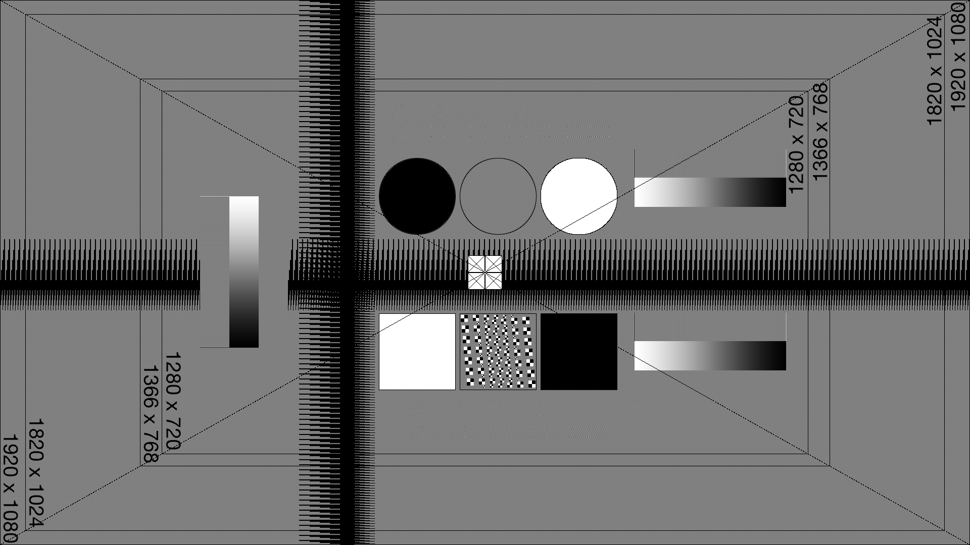
La web Test Pattern for Wide-screen Displays ofrece una carta de ajuste para pantallas Wide-Screen, junto con instrucciones (en inglés) de cómo utilizarla. Ábrela en tu tele de plasma o en el monitor de tu ordenador para ver si lo tienes todo configurado como es debido.
martes, julio 20, 2010
Hipnotiza a tus amigos
jueves, julio 15, 2010
Tog de askTog.com escribe sobre cómo escribir un informe de evaluación heurística, sin ofender al destinatario.
jueves, julio 08, 2010
Cómo crear una sesión de test de usuario
Creating usability test tasks that really motivate users
The magic of usability tests is that you get to see what people actually do with a system (rather than what they say they do). This gives you great insights into how people behave and how to improve your design. But if your tasks lack realism you’ll find that people just go through the motions and don’t engage with the test — reducing the credibility of your results. Here are 6 ways to captivate participants with great test tasks
HCI social Design patterns
http://designingsocialinterfaces.com/patterns/Main_Page
A good example of user badges:
http://stackoverflow.com/badges
A rating algorithm for popularity in forums:
http://www.vbulletin.org/forum/showthread.php?t=199556
miércoles, julio 07, 2010
Good names for faceted search
Facet Naming
In general, you want concise and clear names for facets and facet categories that don’t get truncated in common usage. Below are some guidelines:
- Capitalization – Facet categories should follow headline/title style conventions for capitalization. Facet values are case-sensitive, so make sure the values use consistent casing throughout.
- Plurality - Use the singular form of the category name. For example: Rather than naming a category "Countries," use "Country."
- Brevity and Redundancy - Use as few words as possible to name categories. Keep in mind that the user is already browsing within the context of your collection, so any concepts or words which inherently make sense in that context can be taken as implied. For example: in a collection named "Major League Soccer Players," a facet named "Player Position" could be shortened to "Position." A facet named "Average Points Scored per Game" could be "Average Points / Game," or simply "Average Points." Finally, use the active voice to avoid unnecessarily long phrases.
- Acronyms - While they help with brevity, acronyms may add confusion. Avoid them where possible, unless you know that the target audience will be inherently familiar with them. Try using abbreviations instead.
- Numbers - Use Arabic numerals ("1, 2, 3") rather than spelling them out ("one, two, three"). They’re shorter and easier to read quickly.
- String vs. LongString - LongString is a special type only used for info panel content to be wrapped onto multiple lines. LongString should be used for any text longer than a few words.
- Sorting Behavior - Sorting and grouping is strictly alphabetical. That means that when values starting with "The" appear in PivotViewer, they will be grouped with the T’s.
miércoles, junio 30, 2010
Modelo cibernético del liderazgo
lunes, junio 28, 2010
Divulgacion científica HOW-TO
Successful-science-communication-a-case-study
Cuatro formas de buscar información
Four Modes of Seeking Information and How to Design for Them
Modo 1 - Sé lo que quiero saber
Sabemos qué tipo de información estamos buscando, qué palabras clave utilizar para la consulta, y también sabremos reconocer fácilmente la respuesta correcta. En este caso, la tarea se debería resolver con rapidez si contamos con índices adecuados o un motor de búsqueda.
Modo 2- Exploración
Tenemos cierta idea de qué buscamos, pero no somos expertos en la materia y no sabemos por dónde empezar. En este caso sabríamos reconocer la respuesta pero no sabemos si la información es suficiente o necesitamos seguir buscando información relacionada. La navegación por la estructura de documentos permite hacerse una idea de qué información hay disponible en el área que buscamos.
Modo 3- No sé qué quiero saber
Esta situación se produce cuando pensamos que tenemos un objetivo pero la forma de alcanzarlo no es la que habíamos pensado, o cuando tenemos una necesidad de aprender algo sobre un tema del que no sabemos nada. La información proporcionada en estos casos debe ser concisa y proporcionar respuestas claras y generales sobre el área de conocimiento.
Modo 4- Recuperación
En cierto modo el opuesto del anterior, aquí buscamos algo que sabemos exactamente lo que es ya que lo hemos visto con anterioridad. La información que necesitamos es sólo la posición donde lo localizamos la vez anterior.
miércoles, junio 23, 2010
El mapa del metro de Londres, en tiempo real
Live train map for the London Underground
También están los trenes de Gran Bretaña:
http://traintimes.org.uk:81/map/
martes, junio 22, 2010
¿Es lento mi ordenador?
- 0,1 segundos da la sensación de respuesta instantánea - es decir, el resultado se siente como si hubiera sido causada por el usuario, no el equipo. Este nivel de respuesta es esencial para apoyar la sensación de manipulación directa (manipulación directa es una de las principales técnicas de interfaz gráfica de usuario para aumentar la participación de los usuarios y el control sobre la herramienta).
- 1 segundo mantiene el flujo de pensamiento de los usuarios sin interrupción. Los usuarios detectan un retraso, y así saben que el equipo está generando el resultado, pero todavía se sienten en control de la experiencia en general y se mueven libremente en lugar de esperar al equipo. Este grado de sensibilidad es el que se necesita para una buena navegación por la web.
- 10 segundos mantiene la atención del usuario. De 1 a 10 segundos, los usuarios se sienten definitivamente a merced de la computadora y desearían que fuera más rápido, pero que pueden manejarlo. Después de 10 segundos, empiezan a pensar en otras cosas, por lo que es más difícil de centrar de nuevo la atención en la tarea una vez que el equipo por fin responde.
lunes, mayo 24, 2010
Cómo pintar tus tablas

Consejos de diseño para tablas de información.
http://designshack.co.uk/articles/css/15-tips-for-designing-terrific-tables
domingo, mayo 23, 2010
TABADA! use cases
- TABADA! Multiselect + TABADA! Multiedit: Add an ordering number to all the images taken at the Mexico pyramids.
- TABADA! Dataflow + TABADA! InfoPanels: Show on the desktop all the technology news from the three main online newspapers.
- TABADA! Action!: Publish all items tagged with "keep" to my Facebook account.
martes, mayo 18, 2010
UX design explained to teenagers
"My goal was to prepare them for that project by communicating two key things:
1. Make things for people.
2. Those people aren’t you.
Before the class, Ben warned me about the attention span of his students, and boy was he right. The thing about high school kids is they won’t pretend to be interested if you’ve lost them. Adults at a conference will gaze forward in your general direction, but high school kids will just put their head on the table and go to sleep. If you ever want to get a real gauge of how interesting a speaker you are (or how well you’re really communicating), I highly recommend it, humbling as it is. "
miércoles, mayo 12, 2010
Features or not features
"Features are good. They set Firefox apart from others, and attract users. What bothers users is features that don’t have a mature user interface. The solution should be to fix the interface, not drop the feature."
http://robert.accettura.com/blog/2005/09/04/features-vs-usability/
http://i.bnet.com/pdf/174974-Defeating_Feature_Fatigue_.pdf
http://berkeleymath.com/Documents/Defeating%20Feature%20Fatigue.pdf
martes, mayo 04, 2010
Software interesante
http://www.bisigi-project.org/?lang=en
http://arstechnica.com/gaming/reviews/2010/05/trauma-team-review-melodrama-and-medicine-on-the-wii.ars
http://www.yofrankie.org/download/
domingo, mayo 02, 2010
HCI implicito
Non-gesture interaction, where the computer directly analyzes user behavior:
“Implicit human-computer interaction is an action, performed by the user that is not primarily aimed to interact with a computerized system but which such a system understands as input.” [5]. This is opposed to explicit HCI, where “the user tells the computer at a certain level of abstraction (e.g., by command-line, direct manipulation using a GUI, gesture, or speech input) what she expects the computer to do.” [5]. An example of explicit HCI is using a direct-manipulation graphical user interface (GUI) to drag a file from one folder to another, in order to have the file become located in the target folder. Implicit HCI, on the other hand, requires computers to observe and interpret what the user is doing, via sensors, which may be implemented as physical sensors (e.g., GPS) or digital sensors (e.g., file usage monitor)."
Ejemplo: GNOME busqueda contextual de ficheros
Un buscador asociativo de ficheros usando Gnome zeitgeist. Tiene algoritmos de detección de ficheros relacionados (working sets).
http://seilo.geekyogre.com/2010/03/reviving-gimmie-using-zeitgeist-meet-sezen/
http://vimeo.com/10678237
viernes, abril 30, 2010
Open source usability
http://blog.mozilla.com/faaborg/2010/04/22/dont-talk-about-users/
How can we convert current developers in open source projects to have a skill set equivalent to what academia or a corporation would consider to be formally trained user experience professional? The approach we propose consists of embedding HCI concepts and practices directly into the tools that control an open source community’s work flow.
Lista de palabras clave (keywords) sobre usabilidad que se van a añadir a Bugzilla en el proyecto de Firefox:
http://spreadsheets.google.com/pub?key=tJxF8zTuLdEj9pUcxnLAemA&output=html
miércoles, abril 21, 2010
¿Cómo se llenó mi disco duro?
Cuando el espacio de disco escasea, merece la pena abrir Space Sniffer para ver qué ficheros inecesarios están ocupando la mayor cantidad de espacio, para recuperar el hueco rápidamente.
martes, abril 13, 2010
Microsoft KIN: MS's iPhone contender
- The Loop is the always-on feed reader. In a twist w.r.t. other phones, they make it the default view so that the user always can review the latest feeds from their primary social connections. These can be grouped in several priority layers, which is a nice touch not provided by Facebook.
- The Spot can be a killer feature. It provides a 21st-century clipboard, a place where the various web clips, bookmarks and half-written musings can be collected until the user's ready to compose them into a published article. This provides a predefined and better workflow for this task that doesn't force the user to keep track in short-term memory of all relevant information pieces while composing a post.
- KIN Studio is a lightweight application that works as a end-user repository for captured data, with specialized tools to create metadata and categorize content according to content type, subject, people, geomapping, timestamp.
Each feature on its own provides a nice touch to enhance the blogging/feedback/social network experience. The three of them together can create a tightly focused environment for creating and sharing. I'd like to have it in my hands for 2 hours and feel how they work.
Revisión bibliográfica HOWTO
"La revisión bibliografía permite que centremos nuestra investigación mediante la consideración de trabajos anteriores. Para ello, lo primero que debemos hacer es identificar los términos o “keywords” que van a guiar nuestra investigación, estas palabras clave son las que nos permitan localizar los trabajos previos.
Es importante identificar los trabajos previos publicados para poder focalizar, definir, contrastar o aprovechar la información obtenida, y por que así ayudas a que crezca el cuerpo teórico del HCI."
viernes, abril 09, 2010
Sistemas de recomendación comerciales
Por ejemplo, FilmAffinity (en español) te permite comentar tus películas preferidas, y te crea una lista de recomendaciones de películas que no has visto y te podrían gustar. También te pone en contacto con otros usuarios con gustos similares y te deja ver cómo valoraron cada película.
En DirectedEdge han creado una demostración de su sistema que permite navegar por Wikipedia (en inglés) y te busca artículos relacionados con el que estás leyendo.
Aquí hay una lista de recommender systems comerciales. Si alguna vez construyes un servicio web y quieres añadirle un sistema de recomendación: busca, compara y contrata al mejor.
miércoles, abril 07, 2010
Pie menus and other menu systems
Part of the Novel Input & Output Project
A menu system often serves as the core interaction workhorse of an application. We have researched and productized a few solutions that enhance the user’s experience. Most notably is the marking-menu which allows a user to perform a menu selection by either popping-up a radial menu or by quickly making a straight mark in the direction of the desired menu without popping-up the menu. Other investigations have focused on providing efficient access to a large number of menu-items (the HotBox), menus for pen computers (tracking menus), for rapid tool switching (pieCursor) and multitouch environments (multitouch marking menus).
lunes, abril 05, 2010
Card sorting tools
http://www.measuringuserexperience.com/CardSorting/index.htm
http://rosenfeldmedia.com/books/cardsorting/blog/card_sorting_software_tools/
http://websort.net/
http://www.optimalworkshop.com/optimalsort.htm
http://www.rosenfeldmedia.com/books/cardsorting/blog/card_sort_analysis_spreadsheet/
http://www.stcsig.org/usability/topics/cardsorting.html
http://rashmisinha.com/2005/02/24/card-sorting-analysis-one-size-fits-all-approach/ (comments alternate analysis methods)
Some of them are free for small online samples.
Texto granular en páginas web
Si te instalas este "bookmarklet en la barra de favoritos, en la página actual aparecerá un enlace delante de cada párrafo. La dirección de dicho enlace te permite navegar desde cualquier parte de internet a ese parrafo concreto. Por ejemplo, este enlace (139) te lleva directamente a la parte de este artículo donde compara la informática con la magia de los cuentos de hadas.
martes, marzo 30, 2010
Nielsen Alertbox - diseño paralelo
http://www.useit.com/papers/parallel_design/
Usability howto
Guía paso a paso del proceso de usabilidad
http://usability.gov/methods/process.html
Definition of Usability at usability.gov
- Ease of learning - How fast can a user who has never seen the user interface before learn it sufficiently well to accomplish basic tasks?
- Efficiency of use - Once an experienced user has learned to use the system, how fast can he or she accomplish tasks?
- Memorability - If a user has used the system before, can he or she remember enough to use it effectively the next time or does the user have to start over again learning everything?
- Error frequency and severity - How often do users make errors while using the system, how serious are these errors, and how do users recover from these errors?
- Subjective satisfaction - How much does the user like using the system?
lunes, marzo 29, 2010
Un clásico: nuevas reglas de la real academia de la lengua
"Nunka asetaremo ke potensia etranjera token kabeyo de letra eñe.
Eñe rrepresenta balore ma elebado de tradision ispanika y primero kaeremo mueto ante ke asetar bejasione a simbolo ke a sio korason bibifikante de istoria kastisa epañola unibersa."
La tabla periódica de visualización

http://www.visual-literacy.org/periodic_table/periodic_table.html
jueves, marzo 25, 2010
Hierarchical State Machines for GUIs
Event-driven programming is widely used in [[graphical user interfaces] because it has been adopted by most commercial widget toolkits as the model for interaction. The design of those toolkits has been criticized for promoting an over-simplified model of event-action, leading programmers to create error prone, difficult to extend and excessively complex application code:
Such an approach is fertile ground for bugs for at least three reasons:
1. It always leads to convoluted conditional logic.
2. Each branching point requires evaluation of a complex expression.
3. Switching between different modes requires modifying many variables, which all can easily lead to inconsistencies.
Instead of a low level action-reaction, Miro Samek proposes a better approach using finite State Machines to control the interaction logic necessary to define the state changes to incoming events. Hierarchical State Machines have also been proposed as a high-level model for reactive programs. The UML language in particular provides a complete specification to represent state machines.
Some alternate implementations:
http://accu.org/index.php/journals/252
http://www.eventhelix.com/RealtimeMantra/HierarchicalStateMachine.htm
miércoles, marzo 24, 2010
El Parlamento Europeo y tú
En ocasiones anteriores, los parlamentarios han dado muestra de tomar en consideración los argumentos por iniciativa popular respaldados por un gran número de peticiones.
Por tanto, si tienes alguna queja política y eres ciudadano europeo, ya no tienes excusa para quedarte de brazos cruzados.
jueves, marzo 18, 2010
Hola mundo!
- Inteligencia artificial
- Lenguajes de programación extraños
- Interacción entre humanos y ordenadores (Human-Computer interaction)
- Visualización de datos
- Ciencias (las duras y las blandas)
- aunque no descarto poner de vez en cuando el típico vídeo gracioso viral, o la foto de gatitos adorables.
Sabiendo que mis amigos no sois especialistas en estos asuntos, procuraré que mis comentarios sirvan de introducción a estos enrevesados temas. Estáis a tiempo de eliminarme de vuestra lista ahora, o arrepentiros para siempre ;-)
miércoles, marzo 17, 2010
Programación visual (con Tersus y Qt)
Los cambios que queremos hacer en nuestros archivos se indican como una secuencia de pasos de transformación de datos. Cada paso es una caja, y el orden de los pasos se representa con flechas.
Qt es una herramienta de programación, que dispone de un lenguaje declarativo llamado QML para crear interfaces de aplicación sin tener que detallar todos los pasos que tiene que seguir el ordenador.
http://labs.trolltech.com/page/Projects/Graphics/Kinetic/DeclarativeUI
sábado, marzo 06, 2010
Curriculums creativos
http://www.hongkiat.com/blog/creative-designer-resume-curriculum-vitae/
Imprescindible para personas en profesiones creativas.
Usabilidad y Key Performance Indicators
Enlaza a dos repositorios de KPIs típicas en distintas industrias:
http://www.smartkpis.com/kpi/functional-areas/knowledge-and-innovation/
http://kpilibrary.com/categories/itman
http://uxhealthcheck.com
miércoles, marzo 03, 2010
Multiedit plugin for GNOME gedit
http://blogs.gnome.org/jessevdk/2009/11/15/new-gedit-plugin-multi-edit/
It's like Lapis without the EUD inference engine. I have learned one idea or two from it's approach for usability (in offers exact control, which Lapis does not).
martes, marzo 02, 2010
jueves, febrero 25, 2010
Automusic
http://www.miller-mccune.com/culture-society/triumph-of-the-cyborg-composer-8507/
miércoles, febrero 24, 2010
sábado, febrero 13, 2010
Presentación vista detalle en RAD RIA
http://www.tracked.com/company/microsoft/financials/income
http://designingwebinterfaces.com/ria-screen-layouts
miércoles, febrero 10, 2010
Visualizing user experience
http://www.lukew.com/ff/entry.asp?156
martes, febrero 02, 2010
Adaptive Path - murales de diseño (sketchboards)
http://www.adaptivepath.com/ideas/essays/archives/000863.php
lunes, enero 25, 2010
A taxonomy for storage of data in the Cloud
In a nutshell: Provide constant feedback for the state of all data in distributed on-line services ("the Cloud"), with respect to connection (synchronized, unsynchronized) and access speed (slow, fast).
The problem of storage in a connected world
Information in computers has been traditionally stored in filesystems. This is a storage model that worked well for mainframes and corporate networks, where an expert administrator took care of the filesystems, and that survived a transition to personal computers (somewhat transformed by the "desktop metaphor") where the amount of available data was reduced and limited to a single device.
Most programmers will not realize it most of the time, but files are by itself an abstraction model over a more complex technology model - that of persistent storage media, which handle blocks of electric signals in physical electronic devices.
The abstraction provided by filesystems is less than perfect for the typical data needs of people in the mainstream information sphere, where both corporate and personal users share information through the decentralized system that is the Internet. Not the smaller problem is that nobody will be responsible for administering data, or when they do, this creates a single point of control and failure - two undesirable traits.
The Cloud - on sunny days
The ideal data model for personal user data should be one of "always persistent, always accessible, anywhere". This puts users again in control of the information they own, using a simple centralized abstraction.
The problem is, current technology still doesn't support this directly. The proposed "cloud" metaphor has been marketed to users as an approximation of that model, but it still fails to deliver the promised experience because of abstraction leaks.
Abstraction leaks are situations where there is a mismatch between the model expectations induced by the metaphor and the actual system behavior. Sometimes the limits of underlying technology will skip through the details of the proposed model: network connection will fail, local storage disks will break... The resulting error situation and steps required to fix it are utterly difficult to explain to people not expert in the used technology.
The Cloud Storage taxonomy
There are two axis that directly affect user experience of data stored in the cloud, and thus should be included in the user model for cloud storage:
- Location: Connected vs Disconnected.
- Speed: Fast vs Slow.
Note that Location is not primarily about the physical position of the stored data (which is mostly independent to the problem of data storage, thanks to the Internet) but one of logical access: devices can be a part of the Net sometimes, but sometimes not. Connected/disconnected is the relevant fact to know about a device when thinking of retrieving the same data later.
So, the different and fundamental kinds of persistent data introduced by the Cloud, in addition to the abstraction of "Document" and "Media type" already supported by filesystems, are these four classifications:
* Connected data located in a fast medium.
* Disconnected data located in a fast medium.
* Connected data located in a slow medium.
* Disconnected data located in a slow medium.
Why are these four states relevant, and why should they be treated as different one to each other in the user model?
The first state (connected, fast) is the ideal situation, the one that best matches the promised Cloud metaphor of "always on, anywhere" data. But as soon as the technical limits appear, the experience degrades:
- Disconnected data is one that is created or modified in a device without a connection to the Internet. The problem with disconnected data is that it breaks the Cloud metaphor: if I move to a different device, my new data or recent edits will not be available. This problem is what prompted users to abandon mail clients in favor of webmail, and the reason why web services are the trend.
- Slow data is one that takes time to stabilize and get "imported" into the cloud; it's data I must wait for after I've finished my work. Fast data is instantly protected as soon as it's created; I can be confident that closing the application, unplugging the USB key or turning off the computer will not be a problem - I have enough feedback to be sure that the data is safe. On the contrary, with slow data, in all those scenarios I have babysit the data saving process before I can proceed with my life.
- Disconnected AND slow merits a separate because, in addition to the problems listed above, it shows an important trait: user data is at the highest risk of being lost. Any system problem may cause open data to be destroyed. A simple power glitch, or an application crash will destroy the user current session and all the ongoing work in it will be lost.
Connected slow data can protect against it by saving data in the background; in case of failure the latest online version can be retrieved, even if a bit outdated.
Fast disconnected is even safer in this scenario; a power failure or broken application will not destroy data, because fast data will already be saved to a persistent state. It doesn't protect in the case of a lost or broken device, but that's less severe because for cloud data, disconnected is supposed to be a transient state anyway; as soon as the device gets reconnected, it will synchronize to the cloud and the data will be safe again.
The sad thing is, disconnected slow data is the default storing model for desktop applications, so it's the most common. Online web applications may change this, but they are more likely to copy this dangerous model from desktop apps.
"Saved" state
There's a third dimension (saved / unsaved) that is relevant to system designers and programmers but should be transparent to users, following the principle by Jef Raskin of "treat user data as sacred" (see Your data is sacred, Always safeguard users' data) and its corollary "don't force users to input the same data twice". This means that all user-introduced data should be instantly saved in some way, and it shouldn't be lost except by catastrophic failure (and ideally, even in that case too).
Information architecture of restaurant menus
http://www.guardian.co.uk/lifeandstyle/2010/jan/21/menus-cunning-marketing-ploys
It includes a taxonomy 4 kinds of products:
Profitable:
- Star: popular, profitable
- Puzzle: unpopular, profitable
- Ploughhorse: popular, unprofitable
- Dog: unpopular, unprofitable
viernes, enero 22, 2010
Canvas 3D
Canvas 3D JS Libary
Google O3D
Enlaces a varias librerias
Cross Browser Support
ExplorerCanvas: http://code.google.com/p/explorercanvas/
One using SVG (Scalable Vector Graphics): http://me.eae.net/archive/2005/12/29/canvas-in-ie/
FlashCanvas - using Flash as a bridge: http://www.azarask.in/blog/post/flash-canvas/
The folks at Cappuccino use combinations of various Technologies to accomplish what canvas can do on all browsers. http://cappuccino.org ( http://280slides.com is an example of this.)
Simulated 3D with 2d context
http://www.tapper-ware.net/canvas3d/
http://www.benjoffe.com/code/demos/canvascape/
Firefox Tab prototypes challenge
Mozilla Labs Design Challenge: Summer 09 - together with IxDA and Johnny Holland
finding creative solutions to the question: "Reinventing Tabs in the Browser - How can we create, navigate and manage multiple web sites within the same browser instance?"
jueves, enero 21, 2010
Semantic tools that make sense
http://www.semanticengines.com/plugins.htm
SenseBot for Search Results Page adds SenseBot capabilities to your Google searches. After you add the extension to your browser, it becomes seamlessly integrated with Google results page. When you do a search on Google, a cloud of key concepts appears on top of search results. You can click on a concept to do a subsequent search, focussing on the concept. You can also click the "Show text" button, and a text summary of content of the search results will be generated and displayed on the same page.
Note that summarizing multiple pages as a whole makes more sense for informational queries, i.e. those where you are trying to understand a concept or get an overview of a topic.
• SenseBot Summarizer is an experimental plug-in that generates a text summary of the Web page you are viewing. After you add the extension to your browser, a menu item called "SenseBot" is added to the browser Tools menu. Also, when you right-click on any page, "SenseBot" appears as one of the actions. When you select the action, a popup window is opened containing a text summary of the current page, generated by SenseBot.
Note that there should be a sufficient amount of text accessible from the page in order to generate a summary. Sometimes even pages that look like they are full of content do not fit this requirement (e.g., Yahoo.com). In this case the summarizer will inform you that the text is too short to summarize.• LinkSensor semantically analyzes blog posts on-the-fly and highlights key concepts in the text. When your mouse is over a highlighted word, a small balloon shows up suggesting other articles from the blog related to the word. After you add the extension to your browser, a menu item called "LinkSensor" is added to the browser Tools menu, and is also available in the mouse right-click menu.
If you are a blogger or a publisher, you can get LinkSensor setup for your blog.
miércoles, enero 20, 2010
Good Bad Applications
- Data should not be held ransom inside the walled garden of an application.
- It should be freely editable through the standard Operating System tools,
- and easy to export and import from the application repositories.
Applications, as designed today, tend to make all of the former difficult.
Applications are good
- Applications gather a collection of tools related and suitable to one purpose.
- They organize information and give name to concepts useful to accomplish user goals.
- They make easy for the user to follow task flows pertinent to the goals.
- They allow the user to learn about new concepts in the problem domain, new ways to manage information, and which tools are available in the system for the domain
The concept of an Application is a good information architecture and design pattern for well known problems, where most user needs are anticipated by the designer. If only they weren't niches inside which data gets trapped, they would be a good way to design user interactions!
Wharton’s four questions for user-centered HCI
4 questions for a cognitive walkthrough:
Now this may come as something of a surprise if you are primarily involved in HCI, but these questions are profound to software and web site developers since most will never have considered user interaction in this way
- How do users know their goal is attainable?
- How do users know what to do?
- How will users know they have done the right thing?
- How will users know they have attained their goal?
The Fable of the User-Centered Designer
HCI - Tale - Historia - Cuento del diseño centrado en usuario. Para hacerlo leer a los programadores de /. slashdot cuando se quejan de que los usuarios no saben dar requisitos.
viernes, enero 15, 2010
SocialDesktop4KDE
Integrar en un menú de cada aplicación un diálogo estándar (como el Visor de Ayuda o el About) que permita conectar directamente con las conversaciones de los usuarios, filtrados por cada aplicación.Esto permitiría:
- que los desarrolladores tengan acceso directo de los usuarios reales de su aplicación, en un sitio centralizado. (Gracias al API de Social Desktop, el diálogo estandar podría publicar a cualquier servidor que quieran configurar para su proyecto - o por defecto al servidor público de Social Desktop).
- que los usuarios tengan un sito fácil desde el que reportar bugs y feature requests (la inspiración me la ha dado una propuesta similar de un usuario para Basket). Esta propuesta es una generalización de aquella idea.
- que los usuarios puedan conectar con otros usuarios de la misma aplicación - para compartir trucos, recursos (como el "Get more...", pero social).
-
Update:
Hay nuevo movimiento en forma de proyectos para poner al día y relanzar los sitios web de KDE:
http://blog.lydiapintscher.de/2010/01/17/help-needed-with-kde-org-relaunch/
http://community.kde.org/Scratchpad/www-rework/
... y para integrar la web con las aplicaciones de escritorio (Silk):
http://thread.gmane.org/gmane.comp.kde.devel.core/60677
sábado, enero 09, 2010
Caras transformadas
http://www.faceresearch.org/demos/
viernes, enero 08, 2010
Prototipos dinámicos con AJAX en Visio
A tool that can turn a Microsoft Visio™ project into a webpage. It uses the existing “Save as Webpage” feature, but while this function produces just a set of static images inside a frames structure, VisDynamica is supposed to make the result much closer to a real-life website.
lunes, enero 04, 2010
Objetos más rápidos que la luz
En realidad la teoría (general) de la relatividad sí que admite objetos que se separan más rápido que la luz - de hecho las galaxias más lejanas en el universo observable estarían alejándose de nosotros a una velocidad mayor que c.
La clave para entender esta (aparente) paradoja en la teoría de la relatividad se explica a fondo en el artículo "Expanding Confusion: common misconceptions of cosmological horizons and the superluminal expansion of the Universe" por Tamara M. Davis y Charles H. Lineweaver:
http://arxiv.org/abs/astro-ph/0310808
Aparte de un detallado tratamiento matemático (también incluido en el artículo), la explicación intuitiva de la discrepancia está en que la "imposibilidad de superar c" es sólo una limitación de la teoría de la relatividad especial (es decir, en cuerpos moviéndose dentro del mismo sistema inercial - mismo marco de referencia).
Esto afecta a distancias cósmicas locales, pero no a los objetos más lejanos del universo - que (según lo que he entendido del artículo) pertenecerían a marcos inerciales distintos al nuestro y por tanto no están afectados por esta limitación de su velocidad respecto a nosotros.
El artículo explica cómo la relatividad general es coherente con dichas velocidades superlumínicas. En principio se suele usar la idea de que la expansión del universo puede hacer alejarse los objetos más rápido de lo que la luz viaja "dentro del universo", pero esta explicación sólo desplaza el problema al de entender qué significa eso de la "expansión del universo".
El problema de interpretación surge cuando los físicos intentan hacer divulgación y explicar en términos no matemáticos la explicación intuitiva de dichas fórmulas. Muchas veces, hasta los profesionales se hacen un lío y usan fórmulas de relatividad especial en sitios donde sólo tiene sentido la general (por ejemplo medir la velocidad de quásares con efecto Dopler, asumiendo que tiene que ser sublumínica). En algunas interpretaciones de la teoría esto es necesario, pero en otras no lo es. Los autores achacan estos problemas de intuición, incluso entre profesionales, a que hasta hace muy poco no se disponía de una medición precia de la radiación del fondo de microondas, y sin dicha precisión los márgenes de error eran demasiado amplios para que estas distinciones teóricas fueran relevantes en la práctica observable.
El artículo aporta pruebas empíricas que dan indicios de que las interpretaciones superlumínicas podrían ser correctas (por ejemplo, hay galaxias con mediciones de desplazamiento al rojo que - bajo la relatividad general estándar, sin modificaciones para abordar el fenómeno - corresponderían a galaxias alejándose a velocidad superlumínica).
Finalmente, el artículo desmonta varias de esas "explicaciones intuitivas" erróneas (misconceptions) sobre las interpretaciones de la teoría. Sería incorrecto decir, por tanto, que:
- Mito 1: la velocidad de alejamiento no puede superar la velocidad de la luz. (Pista: sí puede)
- Mito 2: la inflación tras el Big Bang pudo causar la expansión superlumínica del universo, pero la expansión normal no puede. (Pista: también puede)
- Mito 3: existen galaxias alejándose a una velocidad superlumínica, pero nos resulta imposible verlas. (Pista: sí podríamos ver - algunas de ellas/todas/ninguna, en función del modelo cosmológico utilizado).
Y por último una ambigüedad: la forma de representar los horizontes "fundamentales" en los diagramas espaciotemporales introduce problemas conceptuales, ya que el horizonte de Hubble / el horizonte de eventos / y el horizonte de partículas no son necesariamente iguales (tienen distintas definiciones), y sólo serían físicamente idénticos en algunos modelos cosmológicos - pero no en todos.
viernes, enero 01, 2010
Cocina:Partes de la carne
jueves, diciembre 31, 2009
An OR simulation project
SEDETEP - Transformation of the Spanish Operation Research Simulation Working Environment
Describe el propósito de varios módulos de definición de ontologías y requisitos, generación y análisis de experimentos basados en modelos.
A military Spanish project to develop an Operations Research simulation environment, model-based and with reuse between different simulation projects.
Look Ma! I have a tag cloud
miércoles, diciembre 30, 2009
Comparativa de cadenas para la nieve
http://cec-tuning.com/seleccion.htm
Además, unos consejos sobre cómo utilizar las cadenas.
Y la autorización de la DGT para las cadenas de tela.
"Design games" for usability
Using Design Games
At workshops with clients, use games to have a successful session and gather insight for designs.lunes, diciembre 28, 2009
Magic interfaces
http://nui.joshland.org/2009/11/pleasing-brain-with-magical-interfaces.html
Every great magic trick consists of three parts or acts. The first part is called "The Pledge." The magician shows you something ordinary: a deck of cards, a bird or a man. He shows you this object. Perhaps he asks you to inspect it to see if it is indeed real, unaltered, normal. But of course it probably isn't. The second act is called "The Turn." The magician takes the ordinary something and makes it do something extraordinary. Now you're looking for the secret, but you won't find it, because of course you're not really looking. You don't really want to know. You want to be fooled. But you wouldn't clap yet. Because making something disappear isn't enough; you have to bring it back. That's why every magic trick has a third act, the hardest part, the part we call "The Prestige."
Riqueza militar y paz de civilizaciones
La fracción militarizable de la riqueza
Insight sobre la relación entre la potencia militar naval y las rutas comerciales - el equilibrio mundial actual se debería a que la principal tecnología militar actual está conectada con la prosperidad comercial y el avance científico.Mientras la guerra terrestre es intensiva en mano de obra, y depende de la capacidad del Estado para efectuar grandes conscripciones, la guerra en el mar es intensiva en capital.[...]La naturaleza benigna de las talasocracias en la Historia es inevitable: el poder sobre el mar depende no del número de hombres o de los dominios de un Estado, sino de la calidad y abundancia de sus barcos, y los barcos son la herramienta del comercio, es decir, de la prosperidad y la fraternidad internacional.
...
Si nuevas técnicas vuelven a desacoplar la eficacia militar del aumento del nivel de vida y complejidad social, la barbarie podría volver a triunfar.
..y .el equilibrio podría estar cambiando.
miércoles, diciembre 23, 2009
Web app design, BetterExplained.
See also his comments on writing a blog.
And a cheatsheet for javascript, as a bonus.
lunes, diciembre 21, 2009
HCI foundations
Celeste talks about her course.
Boxes and arrows analyzes distinctions between the HCI science and the more limited Interaction Design discipline.
Some links on the History of HCI:
sábado, diciembre 19, 2009
Web Dogma
They seem tailored to convince stakeholders not falling into some very common 'business falltraps' and technicians into not overdoing it.
jueves, diciembre 17, 2009
Netbook reviews
http://www.gizmos.es/23081/ordenadores/navidades-2009-los-5-mejores-netbooks/
http://www.i4u.com/article25008.html
http://computers.toptenreviews.com/netbooks/
Tiendas:
http://www.appinformatica.com/portatiles.htm
Wink y Denim: software para prototipos
Wink
http://www.debugmode.com/wink/
Herramienta experimental para prototipos en Java mediante manipulación directa (sketch) : DENIM
http://dub.washington.edu/projects/denim
The Art of Unix Programming
By ERS (Eric Steven Raymond).
NationMaster, world statistics
So I decided to put together a website that allowed users to generate graphs based on numerical data extracted from the Factbook. The next (rather obvious) realisation was that there's no reason I couldn't take in data from other sources. Why shouldn't the net have a central location that allows you to compare countries on any statistic you like?
miércoles, diciembre 16, 2009
KDE TaskJuggler
http://www.taskjuggler.org/manual-git/features_and_highlights.html
Sketches, prototypes, documentation, and Microsoft Blend
It links to Parti & The Design Sandwich for a way to derive design criteria for a particular project.
Some article higlights:
Sketches and prototypes serve different purposes, even if they are built with the same tools. Take care not to create a prototype while sketching is still needed.
Buxton makes a succinct distinction between sketching and prototyping. Sketches are noncommittal and tentative. They let you suggest, explore, and question. Conversely, prototypes are specific depictions that allow you to describe, refine, and test your design solutions. So, prototypes are refined demonstrations of your design intent.
Design documentation must tell the complete story. Sketches and prototypes don't do that, but are good starting points.
To create an effective demonstration of your design intent, you must consider your audience. I have no problem showing a hand-drawn, static sketch to a design-savvy crowd, who can easily see and understand the invisible behavior with little explanation. However, I am more inclined to show a digital, dynamic sketch or prototype to a mixed room.
Documentation is needed even if it's an afterthought:
Dave points out that various departments within your organization—like quality assurance, legal, or compliance—might need to be able to review the deliverables you create to understand parts of a product. Dan Brown reminds us that we also have to consider other documentation needs like guidelines, standards, and pattern libraries when creating our final deliverables.
lunes, diciembre 14, 2009
Dimensions and principles of design
How does design affect choice?
The design of a place affects the choices people can make, at many levels:
- it affects where people can go and where they cannot: the quality we shall call permeability.
- it affects the range of uses available to people: the quality we shall call variety.
- it affects how easily people can understand what opportunities it offers: the quality we shall call legibility.
- it affects the degree to which people can use a given place for different purposes: the quality we shall call robustness.
- it affects whether the detailed appearance of the place makes people aware of the choices available: the quality we shall call visual appropriateness.
- it affects people’s choice of sensory experiences: the quality we shall call richness.
- it affects the extent to which people can put their own stamp on a place: we shall call this personalization.
Ten principles for good design

miércoles, diciembre 09, 2009
Firefox extensions - the easy way
Jetpack is a Mozilla Labs project that enables anyone who knows HTML, CSS, and JavaScript to create powerful Firefox add-ons. Our goal is to allow anyone who can build a Web site to participate in making the Web a better place to work, communicate and play.

The Usability Methods Toolbox
Glossary and resources of usability methodsmiércoles, noviembre 25, 2009
Monads explained to imperative programmers
I come from an imperative background myself. Let's see if my explanation of I/O and state handling in pure funtional languages, based on imperative metaphors, makes more sense for you. Please let me know if you find the following useful, I might expand it to my own personal "monad tutorial" (this seems to be a tradition when learning Haskell).
- Monads are program structures that represent processes (and one particular kind of process for each kind of monad), but in a different way than functions represent processes. Actually I think of monads as little virtual machines embedded in the functional language, that encapsulate all the boring bookkeeping and boilerplate that must be done in any program alongside the interesting business logic.
- A monad is used as a framework: you will program a sequence (or 'pipeline') of instructions in an imperative style (the do-block), using some vocabulary defined by the monad (the monadic type constructor, and return and bind operators). These blocks can then be instantiated and passed to the monad, to be executed according to the control logic programmed in the monad definition. Side effects during the sequence of actions in the do-block are instructions evaluated outside the do-block, but inside the (functional) monad code.
- As for the I/O and state handling, remember that you have IO and State monads, and that each monad represent one kind of computation. IO represents *processes that interact with the real world*, and state monads represent *processes that depend on an internal state, that changes as the process evolves*. The trick to use them in a pure functional language is that the actual side-effect is not spread all over your programming language, it's encapsulated inside the monad definition.
- The good thing of all this programming style is that you can actually *do* imperative programming, but in a much more controlled manner: instead of relying on the "generic VM" embedded in your imperative programming language (with all its risk of incorrect side-effects) you can execute it in your controled micro-VM defined by the monad. In that way, the only side-effects allowed inside the do-block are those that you enable yourself. Monads work as aspects in OOP: they represent one particular kind of unrelated logic (such as exceptions, concurrency...) that must be processed in the background of your main computation, and can alter its control flow. If you want your block to handle several aspects at once, you can always wrap several monads one inside another with monad transformers.
For example, the List type when used as a monad represents a computation which can return more than one result (or less than one, which is the empty list). Inside a do-block where one instruction has a List result, this means that the following instruction will get executed *once for each element in the list*, with its input parameter being each element. This is used for example in list comprehensions:
do { x <- [1..3] ; y <- [1..x] ; return (x,y) } ---> [ (1,1) , (2,1) , (2,2) , (3,1) , (3,2) , (3,3) ]
Is Haskell a "pure functional" language?
1) Haskell is pure functional, but that means "everything can be described as functions, even side-effects". Side effects happen inside do-blocks during the monad pipeline evaluation, but are side-effects only with respect to the do-block, not with respect to the language (the language views them as function calls over the monadic values).
2) Thanks to monads, you can embed side-effects to the do-block inside the IO monad (whose low-level system calls are then defined as a language primitive embedded in the read/write functions, the same way as it's done in imperative languages with read/write subroutines). If you expand the syntactic sugar of the do-block it gets transformed into a series of function calls, in which the monad state is one input parameter and the new state is in the result. In order to understand how this works, I'm affraid you should also learn about continuations, which complement monads in order to describe imperative execution in terms of functions.
Are side-effects part of the functional language, or something external to it?
We must get a bit philosophical here, in the sense that it depends on how you define "computation". It's been demostrated somewhere that imperative and functional programming are mathematically equivalent (i.e. both have the power of Turing machines). This means that you can represent functional languages using an imperative program, but also that you can represent imperative languages using a functional program.
In fact this is the trick used by Turing himself to solve the decision problem, even before computers existed! Mathematics is purely side-effect free, and yet it's used to describe all possible computations. There's a branch of it called "temporal logic" that is related to how continuations and the State monad work. Logic assertions are universally true, but you can create assertions about the world in a particular state that are not true for other states. By passing the transformed state from one logic expression to the next (or from one function to the next), you can represent state changes. Similarly, continuations are functions that represent *all the instructions left to be executed in the program*, and take as a parameter the current program state.
The one style you use is up to your personal preference, really. Modern Haskell is showing that we could switch all the imperative theoretical basis of programming as were defined during the 40's and 50's to a functional basis, and thus retaining all that can be done with state changes while gaining the reasoning properties of functional.
lunes, noviembre 23, 2009
Mathematical intuitions and pedagogy
Learning a new math concept requires building an intuition to it through examples, not grasping the simplest mathematical definition upfront.
User personas vs archetypes vs roles
http://www.virtualfloorspace.com/2009/09/user-archetypes-vs-personas/
A well-researched example persona for web design:
http://www.virtualfloorspace.com/2009/09/using-personas-to-guide-web-design/
A description of roles (focus on separate usage scenarios and performance, not users)
http://www.foruse.com/articles/rolespersonas.pdf
miércoles, noviembre 18, 2009
martes, noviembre 17, 2009
RAD prototyping tools
Se llama FlashCatalyst. Será un producto comercial, pero de momento la versión beta es pública para obtener feedback.
Otras herramientas RAD prototyping:
Lista: http://www.adaptivepath.com/blog/2009/09/16/rapid-prototyping-tools-revisited/
http://ixedit.com/
https://pidoco.com/en
http://www.balsamiq.com/
http://www.justproto.com/en/
http://protoscript.com/ - comportamientos javascript predefinicos
lunes, noviembre 16, 2009
Effective design for multiple screen sizes
http://mobiforge.com/designing/story/effective-design-multiple-screen-sizeshttp://mobiforge.com/designing/story/mobile-web-design-getting-point-part-ii
A very good interaction for a rating scale
- a slider
- smilies for "significant" points in the scale
- ticks and balloons representing the value of recently rated items
http://blog.steepster.com/post/226679106/better-rating-system
(ESP) - En Steepster, una página dedicada a los tipos de té, han ideado un sistema de medición con muy buena usabilidad.
jueves, noviembre 12, 2009
GMF visual programming generator

Eclipse GMF is a framework to generate visual programming languages from models. The language engine is created (mostly) without the need to program in traditional text languages.
Article explaining it
Introduction
Gallery
miércoles, noviembre 11, 2009
Flow-Based Programming, the book
PDF book
Online extracts
sábado, noviembre 07, 2009
jueves, noviembre 05, 2009
Free (as in Gratis) RAD prototype applicaction
Comparar con Justinmind Prototyper, que cuesta $690. Ver también una tabla comparativa.
Serena Prototype Composer is a free prototyping tool.
http://www.serena.com/products/prototype-composer/index.html
jueves, octubre 29, 2009
Context Free art
Incluye el formato de rendering Anti-Grain Geometry, librería C supuestamente mejor programada que los estándares de antialias usados por los sistemas operativos actuales.
Imagen por Guiguihttp://creativecommons.org/licenses/by-nc-sa/2.0/
viernes, octubre 09, 2009
Semiotic Engineering of HCI
It offers a thorough foundation of Human Computer Interaction as a discipline, following an alternate approach which tries to complement usual HCI practice.
Semiotics is "the study of signs and signification", so it views HCI as an ongoing communication process between the software designer and its user - using the particular software artifacts as the form of messages, and describing the whole process with the established vocabulary and insight of the semiotic science. So far it has added some perspective to my other readings on this subject. In particular it gives a sound justification to those techniques often considered less scientific because of their lack of hard data (heuristic evaluation, user personas, scenarios & storytelling...)
This article from Celeste Lyn Paul, HCI Foundations: Theoretical Frameworks talks about other theoretical frameworks.
HCI Foundations: Theoretical Frameworks
martes, octubre 06, 2009
HCI experience storytelling
How a storytelling method can help unify teams and create better products
Narrativa de la intención del diseñador de una interfaz. (Semiótica del diseño de interacción)sábado, octubre 03, 2009
Chistes de ingenieros vs matemáticos vs informáticos
http://www.math.utah.edu/~cherk/mathjokes.html
http://webpages.sdsmt.edu/~1311104/life%20pics/eng_jokes.htm
An experiment was conducted in order to study the differences between programmers, engineers, and mathematicians. One programmer, one engineer, and one mathematician were all locked in separate classrooms for one week. Each classroom contained all of the normal things you’d find in a classroom: chalkboard, chalk, desks, etc. In addition to that each classroom contained water, one can of food (enough to feed a person for a week), but no can opener. At the end of the week, they opened the programmer’s door first. The programmer walked out. When they looked in the classroom they saw the can beat to hell, but opened. When they opened the engineer’s door, the engineer walked out. In the classroom were a bunch of equations and diagrams written on the board, one small dent in the can which was all that was required to open it. Lastly they opened the mathematician’s door. No one came out. They looked in and saw the mathematician laying dead on the floor, the can of food untouched, and a long series of equations on the chalkboard. But at the end of the equations was written the phrase: “A solution exists”.