Buscar en Mind w/o Soul

viernes, noviembre 30, 2007

Blogs profesionales

Un sitio web de blogs tecnológicos&sociales escritos por profesionales del sector.

Corante: technology, business, media, law, and culture news from the blogosphere
Corante is a trusted, unbiased source on technology, business, law, science, and culture that’s authored by leading commentators and thinkers in their respective fields. Corante also produces premium conferences and publications that help decision-makers better understand their industries and the world around them.

jueves, noviembre 29, 2007

Curso de charla sobre negocios


BusinessWeek Online Courses - The Art of Business Networking - Session Overview
The Art of Business Networking

Tell a friend!

First impressions are critical to developing lasting business relationships. This course helps you understand various networking techniques and develop your informal conversation skills. You'll discover how to change your conversation patterns to improve the effectiveness of your networking. Plus, you'll investigate the hidden meanings in conversations and discover a step-by-step method for making a positive first impression.

Cursos gratuitos de habilidades personales, en la red


Free Online Courses with Business Week Online
Free Online Courses
Instructor-led courses on the latest topics for registered BusinessWeek users


With topics ranging from technology to business, we are sure to offer a course of interest to you. All courses are led by experts in their fields, and offer you the opportunity to interact with the instructors and other students online. Get practical advice related to your business, become smarter with technology, and much more!

martes, noviembre 27, 2007

Arte ruso retro-futurista

Arte procedente de la SF rusa.

Dark Roasted Blend: Retro-Future: To The Stars!
Space never looked better... and perhaps never will

Retro-futuristic art, in a way, is a double-fantasy: imaginary future wrapped in imaginary past. Which makes this style doubly interesting, if not doubly obsolete... In this part we will showcase rarely seen art, done in 1930s to 1970s, mostly from "Teknika Molodezhi" (TM), Yuny Tekhnik, DetGiz (Russia) and German retro-future sites.

viernes, noviembre 23, 2007

Reflexiones de un gay neoconservador

Ampliando perspectivas :-) Esta reflexión resulta especialmente poética.
Enfoque Gay
Y es por eso que resulta tan difícil asumir la idea, empáticamente y desde un punto de vista intelectual, de que Dios pueda rechazar a una de Sus criaturas porque ésta ame. No consigo ver el rostro pérfido de esa conducta, la faceta malvada del amor. Y es también por eso por lo que uno puede ser homosexual y amar a Cristo sin sentirse culpable, frustrado ni rechazado. ¿Piensas que se trata de un examen un poco simple? Quizás, quizás, pero, ¿con qué instrumentos contamos para desenvolvernos en la difícil relación con Dios? ¿Y qué energía atávica nos anima? ¿No es el amor? ¿No es la emoción constructiva que conduce a la fusión de las almas? Y si dos almas se unen por medio de ella, ¿es asequible la idea de que esa unificación desinteresada conduzca al alejamiento de Dios, o sucedería más bien todo lo contrario?


Powered by ScribeFire.

Marketing viral: ya saben cómo vendernos la moto por internet

La estrategia resumida:
  • hacer un vídeo pegadizo
  • pasar la "curva de masa crítica", haciendo artificialmente que esté en la lista de los "más vistos de hoy" (pagando por enlazarlo en blogs famosos, creando cuentas fantasma que enlazan entre sí, posteándolo como comentario en conversaciones...)
  • al principio poner un título engañoso que cause curiosidad, luego cambiarlo por "lo que la gente está buscando"
  • explotar la tecnología de sitios populares, optimizando para para que la presentación llame la atención (imagen previa interesante, etiquetas que hacen aparecer en "videos relacionados" todos los de la misma empresa...) - resumiedo, nuevas técnicas de "optimización en buscadores".
  • hacer comentarios controvertidos, pero borrar los comentarios realmente negativos
  • hacer un seguimiento de la visualización, para medir el impacto real de cada técnica usada (para poder refinarlas).
La duda es, ¿por qué este tipo está desvelando públicamente sus técnicas profesionales de promoción publicitaria?


The Secret Strategies Behind Many “Viral” Videos
Have you ever watched a video with 100,000 views on YouTube and thought to yourself: “How the hell did that video get so many views?” Chances are pretty good that this didn’t happen naturally, but rather that some company worked hard to make it happen – some company like mine.

Over the past year, I have run clandestine marketing campaigns meant to
ensure that promotional videos become truly viral, as these examples
have become in the extreme. In this post, I will share some of the
techniques I use to do my job: to get at least 100,000 people to watch
my clients’ “viral” videos.

Logos 2.0: El diseño se parodia a sí mismo


Nicora | Articles | Learn to create your own Web2.0 Logo
Put a few more final touches on and you are really smokin' now!


Famous Logos Redone In Web 2.0 Format

Diseño visual de blogs


30 More Excellent Blog Designs | Design Showcase | Smashing Magazine
To create an original design you need fresh ideas and creative design solutions. However, you don’t need to go too far with your design experiments. Basically that’s a close attention to finest details which makes a weblog stand out and gives it a fresh flavour and soft touch visitors can recognize immediately.


We’ve selected some more of them — over 30 excellent weblog designs with unusual design approaches; these blogs don’t only have a unique voice, but they also pay close attention to the finest design details.Screenshot Weblog-Design

miércoles, noviembre 21, 2007

TERRORISM AND RADICALIZATION: WHAT TO DO, WHAT NOT TO DO

Análisis de la estructura y propiedades de las redes terroristas

Edge
TERRORISM AND RADICALIZATION: WHAT TO DO, WHAT NOT TO DO
by Scott Atran

Consejos sobre tarjetas de crédito

Cómo no meterse en líos con los créditos

Slashdot | The Evolving Face of Credit Card Scams
  • Get on the OPTOUT list to stop preapproved offers.
  • Don't accept a card with a yearly fee, unless there are travel or purchase rewards that you're sure you will use.
  • If you have good credit, ignore all offers above 10-12% (excepting rewards cards). I have a 7.9% national city card.
  • Don't open new credit card accounts if you're about to buy a house or car.
  • Reject offers at the register. There's no possible way you can read the fine print at the checkout.
  • Only consider accepting an offer at the register if the discount is
    at least $50. 10% of $500+. Deactivate the card after a few weeks or so.
  • Don't ignore a bill sent to you on a deactivated card. It won't go away on its own.
  • Don't signup for insurance through your credit card company. Buy insurance directly from an insurance company.
  • Don't transfer debt onto a new card unless its free. No percent fee and no minimum fixed fee.
  • A free transfer to a low or zero interest card is not a bad thing,
    so long as the introductory rate is long enough to be worth it, such as
    9-12 months, and the non-introductory rate is fair.
  • Don't use convenience checks tied to the credit card. After the
    temporary rate expires, they nearly always apply as a cash advance
    (which is much higher rate).
  • When not traveling, don't use ATMs outside the bank's network.
  • Use a debit card for cash advances and groceries. Use a credit card for travel, online purchases, shipping, and other purchases.
  • Occasionally check your online statement history for unexplained
    purchases. I do this at least 3-4+ times a month, usually at work as an
    excuse to goof off for a moment.
  • Setup a minimum fee payment schedule on all your credit cards
    within each respective card company even if you rarely carry balances.
    Don't use a 3rd party bill-pay for credit cards. If the bill-pay is
    down, you'll be held responsible if you're late. You have a stronger
    case for dropping late fees if it's your own credit card company's
    fault.

martes, noviembre 20, 2007

Algunas preguntas básicas sobre ciencia

Conceptos elementales del funcionamiento de la ciencia, explicados para el público en general.

Algunas preguntas básicas sobre ciencia | Teleobjetivo
Del mismo modo que no tiene sentido preguntar por las revoluciones por minuto de un trozo de acero (a pesar de que los motores están hechos de este metal), tampoco tiene ningún sentido pretender describir su funcionamiento a partir de las propiedades químicas del metal. Otro ejemplo sería que, a pesar de que el acero no flota, los barcos si flotan (a pesar de que están hechos de acero).

En resumen, cuando hablamos de ciencia el primer concepto a tener claro es que las leyes naturales tienen un ámbito de aplicación concreto, y que fuera de ese ámbito no solo no tienen sentido, sino que pueden llevarnos a contradicciones y paradojas.

lunes, noviembre 19, 2007

Entrevista: Linux en el instituto

Entrevista al director de un instituto de Sigüenza, que gracias a Linux ha puesto un ordenador en cada aula.

El Afilador | Linux en el instituto
Preguntamos sobre las características de la instalación a la empresa de informática seguntina Entorno PC. Nos recalcan el aspecto ecológico de estas actuaciones, “los ordenadores que se han reutilizado, si no hubiéramos puesto Linux, su destino hubiera sido la basura”. Se ha instalado Molinux, una distribución de Linux creada por la de la Junta de Castilla-La Mancha, concretamente la versión denominada Rocinante. Sobre los requisitos mínimos para instalación dicen que “con 256 de memoria Ram o incluso con menos se puede llevar a cabo”. Hay que tener en cuenta que “ahora con la nueva versión de Windows, el Vista, con un 1Gb de Ram incluso tienes problemas comprándote un ordenador nuevo”.

viernes, noviembre 16, 2007

Una sencilla teoría de todo

Según esa teoría, este es el universo (por dentro):
Graph of E8 Gosset polytope, 42,1Coxeter-Dynkin diagram:

La teoría utiliza un objeto matemático que recién se ha calculado por completo, el grupo de simetrías E8. El autor ha hecho corresponder las partículas subatómicas conocidas -para las 4 fuerzas fundamentales- con las distintas partes de las simetrías. Le aparecen 20 nuevas partículas no conocidas, que podrían ser descubiertas experimentalmente y podrían confirmar la teoría. Éste es el mejor comentario en slashdot sobre la teoría.
Aquí se explica qué es el E8 (si sabes algo de espacios vectoriales), y cómo lo calcularon:
Dynkin diagram of the E8 root system

Slashdot | A New Theory of Everything?
"The Telegraph is running a story about a new Unified Theory of Physics. Garrett Lisi has presented a paper called "An Exceptionally Simple Theory of Everything" which unifies the Standard Model with gravity — without using string theory. The trick was to use E8 geometry which you may remember from an earlier Slashdot article. Lisi's theory predicts 20 new particles which he hopes might turn up in the Large Hadron Collider."

miércoles, noviembre 14, 2007

Ciencia en la cocina


CienciaNet : En la cocina
Bienvenido al lugar donde los tubos de ensayo
se juntan con los pucheros: un poco de gastronomía, nutrición,
dietética y tecnología de la alimentación tratado todo desde un punto
de vista divertido.

Experimenta
con los principios científicos en que se basan las distintas labores
culinarias.


¿Cómo funcionan los aparatos que hay
en nuestra cocina?


Conoce los fundamentos de la
alimentación así como de las técnicas empleadas en la cocina.


Powered by ScribeFire.

Este tío ha alcanzado la iluminación

Pero los sitios programados en Flash y OpenLazslo no se pueden enlazar. Le falla la usabilidad.

http://worrydream.com/


De mayor quiero ser como éste.

Tinta mágica: eliminando la interfaz de usuario

Este artículo presenta una teoría unificadora de la "interfaz invisible". Temas de psicología cognitiva, programación basada en ejemplos / por demostración...

Este tío sabe de lo que habla.


Magic Ink: Information Software and the Graphical Interface
Reducing interaction


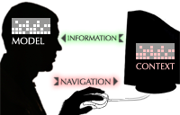
# When the user is forced to interact, the software assumes the form of manipulation software. The external model, manipulated through navigation, is the software’s model of the context. However, unlike genuine manipulation software, the user does not care about this model—it is merely a means to the end of seeing relevant information.

# The designer’s goal is to let the user adequately shape the context model with as little manipulation as possible. Assuming that graphic design, history, and the environment have been taken as far as they will go, there are a few techniques that can lessen the impact of the remaining interaction:

* Graphical manipulation domains present the context model in an appropriate, informative setting.
* Relative navigation lets the user correct the model, not construct it.
* Tight feedback loops let the user stop manipulating when she’s close enough.

martes, noviembre 13, 2007

Concurrencia funcional en el lenguaje E

Un ejemplo de paralelismo manejado por un lenguaje de alto nivel.

Walnut/Distributed Computing - Erights

Eventually Operator


All distributed computing in E starts with the eventually operator, "<-":


 # E syntax
pragma.syntax("0.9")
car <- moveTo(2,3)
println("car will eventually move to 2,3. But not yet.")

Promises


When you make an eventual send to an object (referred to hereafter simply as a send, which contrasts with a call
to a local object that waits for the action to complete), even though
the action may not occur for a long time, you immediately get back a
promise for the result of the action:


 # E syntax
def carVow := makeCar <- ("Mercedes")
carVow <- moveTo(2,3)


Powered by ScribeFire.

Interfaz futurista - reconocimiento de gestos

Una mesa que sigue los gestos de las manos.

Interactive Scientific Visualization Techniques
A “human-centered” environment uses both interactions and visualizations that take into account more fully a human’s performance and capabilities than currently supported in today’s desktop interfaces. These environments can support wide-field-of-view, stereoscopic display, and multimodal interaction including gesture-based interactions to create systems that take the best from both computer and noncomputer based interactions.

lunes, noviembre 12, 2007

Escultura atómica

Imágenes tomadas con microscopio electrónico. Algunas de ellas muestran átomos dispuestos por el fotógrafo en auténticas esculturas microscópicas.

STM Image Gallery - Catalogue
STM Image Gallery

L' Hexagone


STM6 Link


STM2 Link


STM1 Link


STM4 Link


STM9 Link


GDAC Link


Blue Period


STM12 Link


STM13 Link


Atomilism


STM11 Link


STM5 Link


STM10 Link


The Corral Reef


STM7 Link


STM14 Link


STM15 Link


STM16 Link


STM17 Link

Medir el User Experience - HOWTO

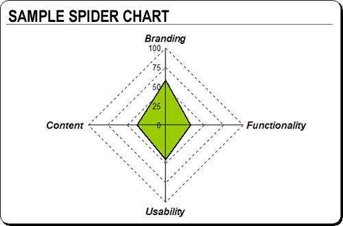
Encuesta para medir numéricamente la calidad de la experiencia de usuario, en cuatro áreas:

How To Quantify The User Experience [Usability and Information Architecture]
1322_Graphic3

Branding


Branding includes all the aesthetic and design-related items within
a Website. It entails the site's creative projection of the desired
organizational image and message. Statements used to measure branding
can include:


  • The site provides visitors with an engaging and memorable experience.
  • The visual impact of the site is consistent with the brand identity.
  • Graphics, collaterals and multimedia add value to the experience.
  • The site delivers on the perceived promise of the brand.
  • The site leverages the capabilities of the medium to enhance or extend the brand.


    Functionality


  • Functionality includes all the technical and 'behind the scenes'
    processes and applications. It entails the site's delivery of
    interactive services to all end users, and it's important to note that
    this sometimes means both the public as well as administrators.
    Statements used to measure a site's functionality can include:


  • Users receive timely responses to their queries or submissions.
  • Task progress is clearly communicated (e.g., success pages or email updates).
  • The Website and applications adhere to common security and privacy standards.
  • Online functions are integrated with offline business processes.
  • The site contains administration tools that enhance administrator efficiency.


Usability


Usability entails the general ease of use of all site components and
features. Sub-topics beneath the usability banner can include
navigation and accessibility. Statements used to measure usability might include:


  • The site prevents errors and helps the user recover from them.
  • Overall page weight is optimized for the main target audience.
  • The site helps its visitors accomplish common goals and tasks.
  • The site adheres to its own consistency and standards.
  • The site provides content for users with disabilities.


Content


Content refers to the actual content of the site (text, multimedia,
images) as well as its structure, or information architecture. We look
to see how the information and content are structured in terms of
defined user needs and client business requirements. Statements used to
measure content can include:


  • Link density provides clarity and easy navigation.
  • Content is structured in a way that facilitates the achievement of user goals.
  • Content is up-to-date and accurate.
  • Content is appropriate to customer needs and business goals.
  • Content across multiple languages is comprehensive.

Matices en las definiciones de HCI

Apurando al máximo: definiciones precisas de los términos relacionados con el diseño de interfaces de ordenador, con los matices que diferencian unos de otros

ON: Digital+Marketing: ON: Experience Design 101
User_experience_design_explained

Getting The Terms Right


  • User experience is a term used to describe the overall experience
    and satisfaction a user has when using a product or system. It most
    commonly refers to a combination of software and business topics, such
    as selling over the web, but it applies to any result of interaction
    design. Wikipedia definition

  • Interaction design is a sub-discipline of design which examines the
    role of embedded behaviors and intelligence in physical and virtual
    spaces as well as the convergence of physical and digital products.
    Sometimes referred to by the acronyms “IxD” or “iD”… Wikipedia definition

  • Information Architecture (IA) is the art and science of structuring
    knowledge (technically data), and defining user interactions. Wikipedia definition
  • Usability is the measure of the ease with which particular people
    can employ a particular tool or other human-made object in order to
    achieve a particular goal. Usability can also refer to the methods of
    measuring usability and the study of the principles that may predict
    whether an object is found usable in practice. Wikipedia definition
  • Human-computer interaction (HCI) is the study of interaction
    between people (users) and computers. It is an interdisciplinary
    subject, relating computer science with many other fields of study and
    research. Wikipedia definition
  • Human factors engineering, also referred to as Ergonomics is the
    study of optimizing the interface between human beings, and the
    designed objects and environments they interact with. Wikipedia definition
  • User interface design is the overall process of designing the
    interaction between a human (user) and a machine (computer). It
    includes graphic design, information design and a wide variety of
    usability methods. Wikipedia definition


Artículo de Will Wright sobre diseño de juegos de simulación

El mayor gurú de los videojuegos de final abierto, explica cómo se hacen!

Designing User Interfaces to Simulation Games.
A summary of Will Wright's talk, by Don Hopkins.


Will Wright, the designer of
SimCity,
SimEarth, SimAnt, and other popular games
from Maxis, gave a talk at Terry Winnograd's user interface class at
Stanford.


He reflected on the design of simulators and user interfaces in
SimCity, SimEarth, and SimAnt. He demonstrated several of his games,
including his current project, Dollhouse.

The anatomy of a simulation game:


There are several tightly coupled parts of a simulation game that must
be designed closely together: the simulation model, the game play,
the user interface, and the user's model.


Sim City, liberado para la educación

Electronic Arts ha donado el código fuente del SimCity original como código abierto, para ser usado en el proyecto educativo One Laptop Per Child.

Games that can educate: SimCity donated to OLPC project


"The goal is to enable the open-source community to renovate SimCity
and take it in new educational directions, by applying Seymour Papert's
ideas about constructionist education, Alan Kay's ideas about
interactive user interfaces and object-oriented programming, Ben
Shneiderman's ideas about direct manipulation and info visualization,
and many exciting ideas about multiplayer games, blogging,
storytelling, game mods, player created content, and lessons learned
from World of WarCraft, The Sims, Spore, etc," Hopkins
wrote in a comment at Slashdot earlier this year.

domingo, noviembre 11, 2007

HCI - Interrupciones humanas

Cuándo es el mejor momento para que el ordenador te obligue a cambiar de tarea. Human scheduler (attention manager).

Designed interruptions | BlogSchmog
Designed interruptions by Kevin Makice Last spring, Brian Bailey made the trip from Illinois to talk to our IU School of Informatics HCI group about his research on alerts. Bailey and fellow researchers—like doctoral student Shamsi Iqbal—have painstakingly explored the nature of task interruptions in trying to identify the best times to alert users to new information.


Powered by ScribeFire.

Ubuntu Gutsy Howto


pasteler0 » Blog Archive » 10 Things To Do Just After Installing Ubuntu 7.10
10 Things To Do Just After Installing Ubuntu 7.10

Ubuntu is a very complete OS, especially the Gutsy Gibbon (7.10), but there are still make tweaks you can do just after installing it that will make Ubuntu shine like never. I will explain here some things I do just after have ubuntu installed. Remember that what I’ve written here are the best things to install for ME, you may consider not making some of them or installing many different things, but if so, please, share your wisdom with us all.


Powered by ScribeFire.

miércoles, noviembre 07, 2007

Juegos gratis online

Artículo sobre los mejores juegos Flash, y comentario de la noticia en /.

Slashdot | What Are The Best Free Games Online?

CNET has just put up a story about what it thinks are the best online flash games of all time.
These include titles like Line Rider, Bejeweled, Desktop Tower Defense
and Portal, all of which I enjoy playing a lot. But my thirst for free
games is peaking at the moment, probably due to an incredibly boring
job and lack of imagination. Can you suggest any more good free games
online?"
The purpose of the article is Flash Games in specific. So your examples are neither here nor there. Personally, I'm amazed that no one has mentioned Newgrounds Rumble, one of the best brawlers of all time! It was one of the highest rated games over on Newgrounds, and hung around for AGES. More recently, it was ported to WiiCade so that you could play against your friends on the WiiMote controller. (Which is a lot more fun than trying to share a keyboard, let me tell you.)

Actually, I should probably expand on that a bit more. One of the nice things about the Wii is that you can have multiplayer flash games. Games like Wiimote Wars 2 and Slipstream are simply amazing when you get the chance to play against your friends and family members. Much, much, much better than playing single-player games. Which is good, because there isn't much in the way of online-multiplayer flash games.

martes, noviembre 06, 2007

Historia de la interfaz gráfica

Historia de los elementos más comunes de las GUIs modernas

Common Usability Terms, pt. I: Spatial Memory - OSNews.com
This is the first article in a series on common usability and graphical user interface related terms. On the internet, and especially in forum discussions like we all have here on OSNews, it is almost certain that in any given discussion, someone will most likely bring up usability and GUI related terms - things like spatial memory, widgets, consistency, Fitts' Law, and more. The aim of this series is to explain these terms, learn something about their origins, and finally rate their importance in the field of usability and (graphical) user interface design. We start off with spatial memory - my personal favourite.

Las 5 competencias para diseñar HCI


The Five Competencies of User Experience Design :: UXmatters
I use a framework I discovered early in my career: The Five Competencies of User Experience Design. This framework comprises the competencies a UX professional or team requires. The following sections describe these five competencies, outline some questions each competency must answer, and show the groundwork and deliverables for which each competency is responsible.

Information Architecture

Interaction Design

Usability Engineering

Visual Design

Prototype Engineering

Metáfora de Zoom en el One Laptop Per Child

El proyecto OLPC está desarrollando una interfaz con una metáfora no basada en el escritorio, sino en la red social de usuarios. Utiliza un ZUI basado en Zoom semántico para representar las actividades de los participantes.

OLPC Human Interface Guidelines/The Laptop Experience/Zoom Metaphor - OLPCWiki

Zoom Metaphor


Four distinct zoom levels define the laptop: Neighborhood, Groups, Home, and Activity

The mesh network is a permanent fixture of the laptop environment
and is represented explicitly in the interface. A zoom is used to
relate four discrete views, each of which caters to a particular set of
goals: Home, Groups, Neighborhood, and Activity. Using keyboard
shortcuts or controls in the Frame, children may zoom in and out on the mesh community.

Zoom Metaphor
Four distinct zoom levels define the laptop: Neighborhood, Groups, Home, and Activity

The mesh network is a permanent fixture of the laptop environment and is represented explicitly in the interface. A zoom is used to relate four discrete views, each of which caters to a particular set of goals: Home, Groups, Neighborhood, and Activity. Using keyboard shortcuts or controls in the Frame, children may zoom in and out on the mesh community.
The Neighborhood view (or Mesh view): All children visible on the mesh network can be seen clustered around shared activities; Away messages are also accessible from this view.The Home view: Each child chooses a dual-tone color scheme for her XO character that is used throughout the interface. Activity icons are color-coded by the child who launched the activity.The Groups view: Members of the currently selected group and their current activities are visible from this view. Hovering over a “missing” XO reveals an "away message."

lunes, noviembre 05, 2007

Gadgets de Google Social

Google Social es la nueva API de Google para integrar las redes sociales de la competencia bajo su control. Google Gadgets es su librería para facilitar el desarrollo de web apps.


Getting Started - Google Gadgets - Google Code


Welcome to the Google Gadgets API! This developer
guide is intended for people who want to use the Google Gadgets API
to write gadgets. Gadgets
are so easy to create that they are a good starting point if you are
just learning about web programming.


Contents


  1. "Hello,
    World"
  2. What's In a Gadget?
  3. Google Gadgets Editor: Get Started Now
  4. Where to Go From Here

Shelves: una funcion muy util de control de versiones

Las Shelves son un concepto muy práctico en control de versiones, son una versión "ligera" de la creación de ramas. Este artículo explica cómo usar Subversion para crear Shelves.

Shelves in Subversion
Shelves in Subversion There is a popular feature called "shelves" that was included in Microsoft's Visual Studio Team System. I am fairly certain that VSTS is not the first or only tool to have this feature and in this article I will show you how to get the same feature from Subversion. I think of shelves as essentially creating and using a branch to save some changes you have been working on, but now need to set aside, or shelve, for a while.

Documentación Visual Studio:

The Purpose of Shelving

Shelve your pending changes when you are not ready to or cannot check in a set of pending changes. There are primarily five shelve scenarios:

  • Interrupt When you have pending changes that are not ready for check in but you need to work on a different task, you can shelve your pending changes to set them aside.

  • Integration When you have pending changes that are not ready for check in but you need to share them with another team member, you can shelve your pending changes and ask your team member to unshelve them.

  • Review When you have pending changes that are ready for check-in and have to be code-reviewed, you can shelve your changes and inform the code reviewer of the shelveset.

  • Backup When you have work in progress that you want to back up, but are not ready to check in, you can shelve your changes to have them preserved on the Team Foundation server.

  • Handoff When you have work in progress that is to be completed by another team member, you can shelve your changes to make a handoff easier.

Demasiados megapixels no son buenos

Al aumentar a demasiados megapíxeles en una cámara compacta, se reduce la calidad de la imagen por culpa del ruido introducido.

» Best picture quality with 6 megapixels!
The reason we bring this up is the vicious circle we are in and have to break out of. Most people heard that a lot of pixels make a good camera hence they buy cameras with the most pixels. Therefore the manufacturers produce cameras with more and more pixels so that they sell better. But this does not improve the quality of the pictures.

This website is our little contribution for clarification and will hopefully get noticed by the public and the manufacturers.

The reason we bring this up is the vicious circle we are in and have
to break out of. Most people heard that a lot of pixels make a good
camera hence they buy cameras with the most pixels. Therefore the
manufacturers produce cameras with more and more pixels so that they
sell better. But this does not improve the quality of the pictures.


This website is our little contribution for clarification and will hopefully get noticed by the public and the manufacturers.


kompromiss.jpg 6
megapixels- the best compromise between number of pixels and image
noise. It is demonstrated: the increase of details with more pixels and
the increase of errors if the pixels get too small.

kompromiss.jpg 6 megapixels- the best compromise between number of pixels and image noise. It is demonstrated: the increase of details with more pixels and the increase of errors if the pixels get too small.

viernes, noviembre 02, 2007

Usabilidad de motores búsqueda

La usabilidad no se consigue con focus groups, porque éstos son encuestas de opinión a un grupo de gente. La usabilidad mide actividades/ acciones reales de un usuario concreto, no opiniones de un conjunto.

Understanding Search Usability
Focus groups measure group opinions about an interface. A focus group's measurements are not task oriented. The negative aspect of focus groups is a herd mentality. Granted, if I do not like an interface and genuinely would not use it, no amount of peer pressure is going to get me to change my opinion. But that is just me. Peer pressure often yields poor interfaces.

Berrypicking: cómo busca información la gente, en realidad

Artículo seminal sobre la teoría de la búsqueda. Information foraging, refinamiento iterativo de la búsqueda, search engines...

The Design of Browsing and Berrypicking Techniques

ABSTRACT


First, a new model of searching in online and other information systems, called
"berrypicking," is discussed. This model, it is argued, is much closer
to the real behavior of information searchers than the traditional model of
information retrieval is, and, consequently, will guide our thinking better
in the design of effective interfaces. Second, the research literature of manual
information seeking behavior is drawn on for suggestions of capabilities that
users might like to have in online systems. Third, based on the new model and
the research on information seeking, suggestions are made for how new search
capabilities could be incorporated into the design of search interfaces. Particular
attention is given to the nature and types of browsing that can be facilitated.

Figure 2 represents a berrypicking, evolving search.

In Figure 3 we see the size of the picture shrunk in order to show the context within which the search takes place.

Como comprar/construirse el Media Center perfecto


Designing FiringSquad’s Reference Home Theaters
Designing
FiringSquad’s Reference Home Theaters
Building a home theater is no different than building a custom
computer. Just as you can buy a complete PC from HP starting for a
couple hundred or a Blackbird 002 for a couple grand, you can certainly
save time by going with a pre-packaged home-theater-in-a-box (HTIB).
HTIBs aren’t synonymous with budget-quality performance either. While
Wal-Mart’s $59.87 “5.1 Durabrand Home Theater System” won’t bring the
full movie theater experience home, I’m sure it’ll outperform the
speakers on the $300 TV it is probably going to be used with. Likewise,
there is probably no better premium pre-packaged HTIB solution than the
JBL Synthesis line, which starts at $15,000 for an entry-level setup,
sufficient to provide reference quality movie experience in the home,
to the Synthesis Everest, retailing at over $200,000 and featuring four
18” subs, and 800 watts per channel into 11 speakers.


Slashdot | Building a "Reference" Home Theater
Here's a much more useful article for anyone who actually wants to setup a great HT. My version's also going to be much shorter and based on much better research, since I actually occasionally work as an independant HT consultant to help people out:

1. For speakers go to Ascend Acoustics. The 170's are great, if you have a small room, go ahead and get the even smaller ones. Buy them w/the mounting bracket and aim 'em all towards the center of the "sweet spot" you want in your room. $1200 w/shipping and brackets.