Interfaces con fotografías

Recommendations for photography in next-generation interfaces
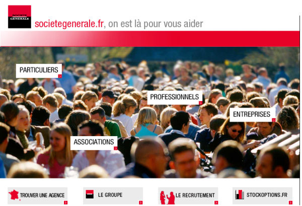
- Integrate the images into the interaction design. This can be achieved by making areas responsive to user behaviour, enhancing its function from a visual element to an instrument of interaction. Due to its realistic and nonverbal nature, photography can be equally or more powerful than icons, buttons or other classic interface elements.
- Work with screen space. Place images in a way that they have a real impact on the overall appearance instead of putting them into small banner-like screen areas.
- Photography invokes an emotional reaction and has the capability to create a certain ambiance more easily than other media. Use pictures that make the user feel comfortable and adequate to the application context.
- Clarity, structure, movement, separation, union – photos can convey messages instantly to the viewer, by means of blur, motion, composition, and of course motive. Work with these as design elements.
- If used as content element, think about alternatives to simply placing photography on a grid. There are a lot of possibilities to make images "tangible" to the user. Think of multiple layers, movable objects, or 3D approaches.
- Keep the subject of the application and the nature of the content in mind while designing. Choose photos that convey a real meaning and make sense in the application context. Avoid standard (stock) images or those with only decorative function. Prefer custom-made images tailored to your intentions and requirements.
- Combine and integrate all elements to create a holistic interface design where all visual elements work together and make the interface.

No hay comentarios:
Publicar un comentario